Boosting engagement & cutting support costs
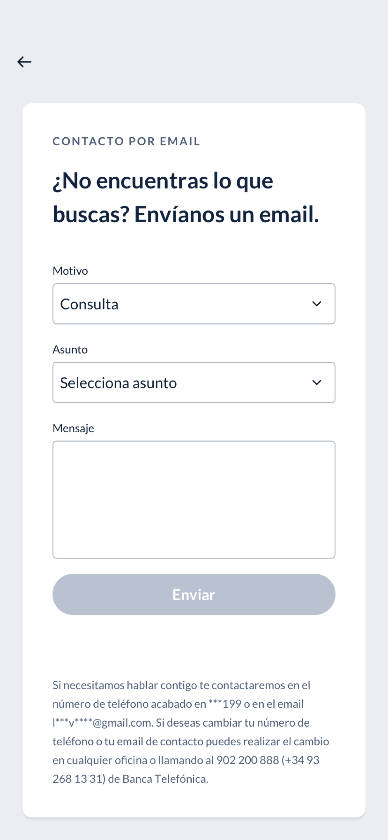
Redesigned a banking platform to improve usability for customer-investors, increase engagement, and reduce support queries while promoting personalized financial advisor interactions.


Better UX, lower costs, higher revenue
The redesign delivered significant business results: streamlined navigation improved user efficiency, strategic design changes reduced support queries while increasing financial advisor engagement, product restructuring optimized revenue by promoting high-value offerings, and Ilunion AA certification expanded market reach through inclusive design.
Analyze, design, deliver
Analysis
We mapped the existing information architecture, analyzed user behavior data, identified pain points through research, and assessed technical constraints to establish the redesign foundation.
1Strategic foundation
We developed an optimized navigation structure, created a jobs-to-be-done framework to align features with user needs, established a brand-compliant Design System, and built a component gallery for consistent implementation.
2Design
We created detailed wireframes, developed targeted solutions for each module, and executed iterative refinement through continuous stakeholder and user validation.
3Challenge 1
Navigation pain points discovery
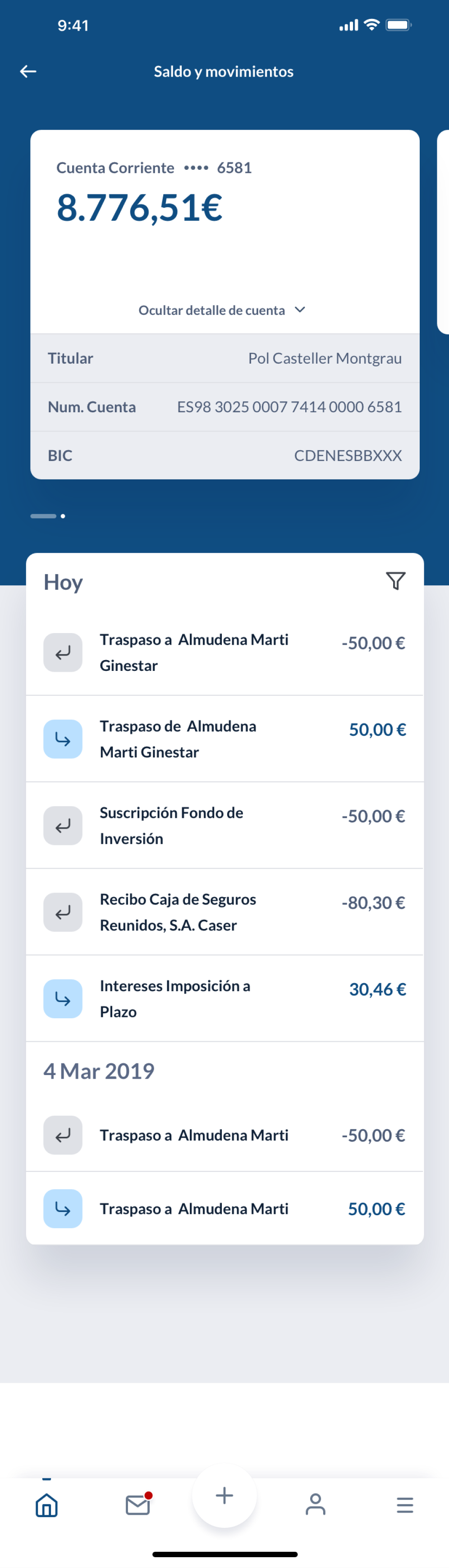
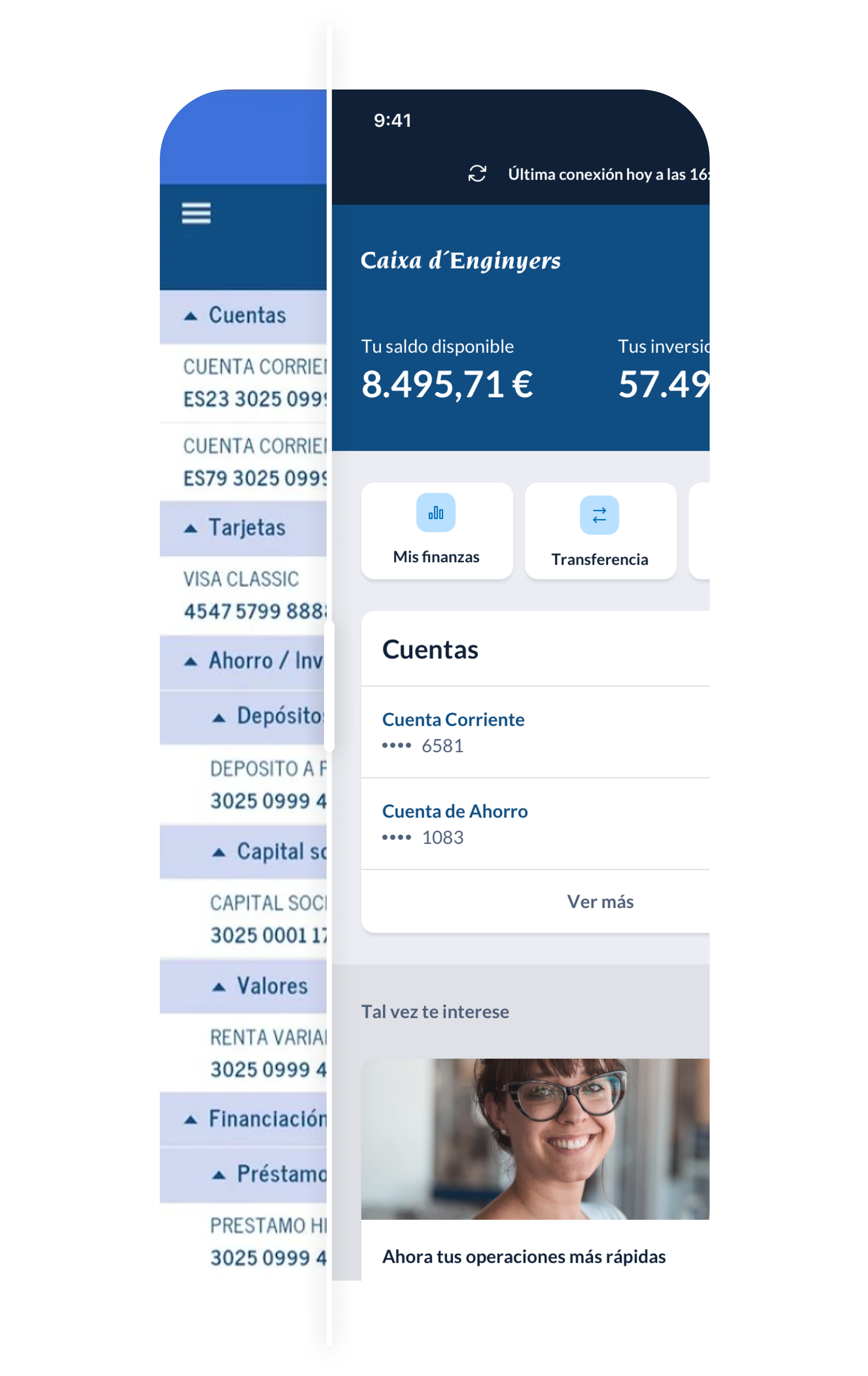
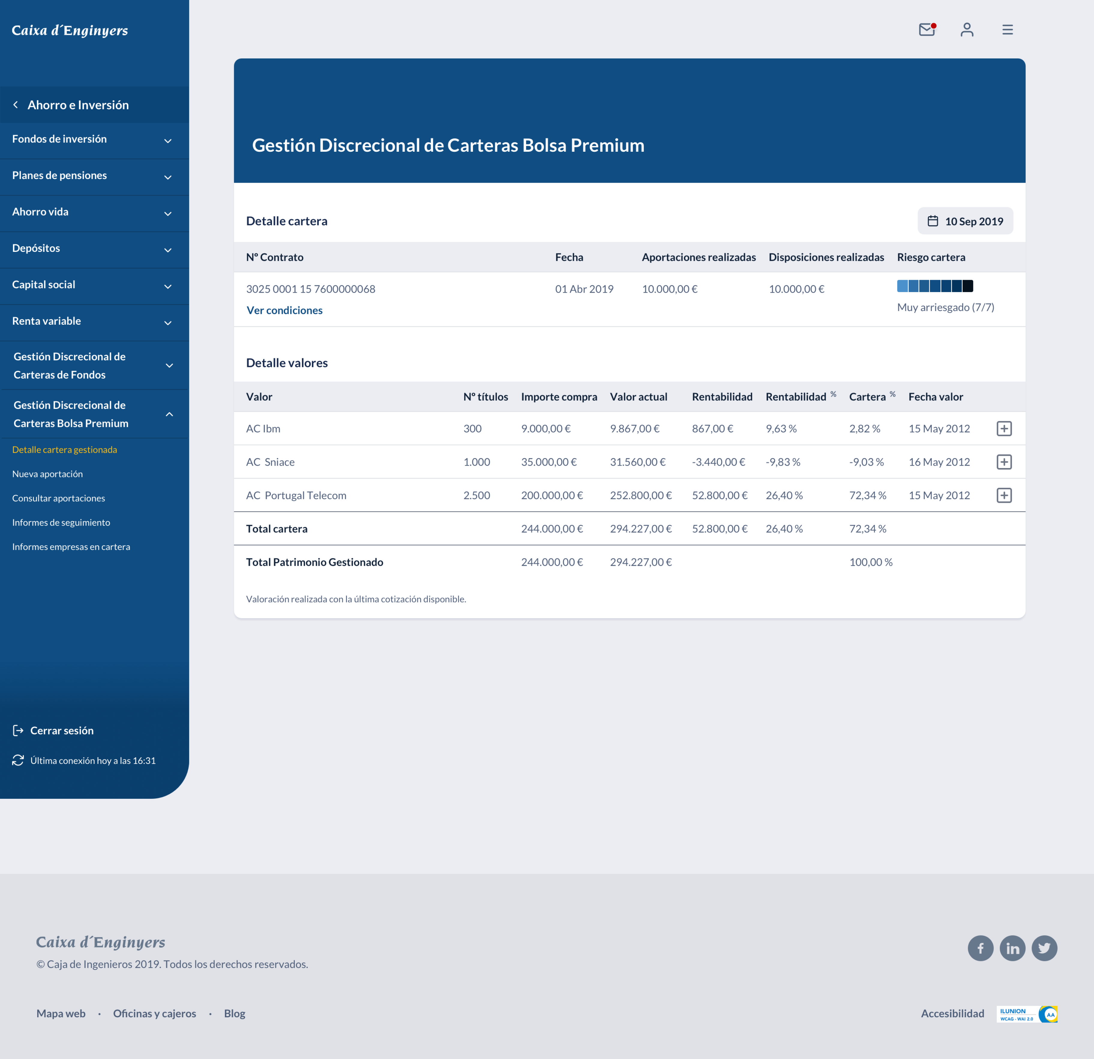
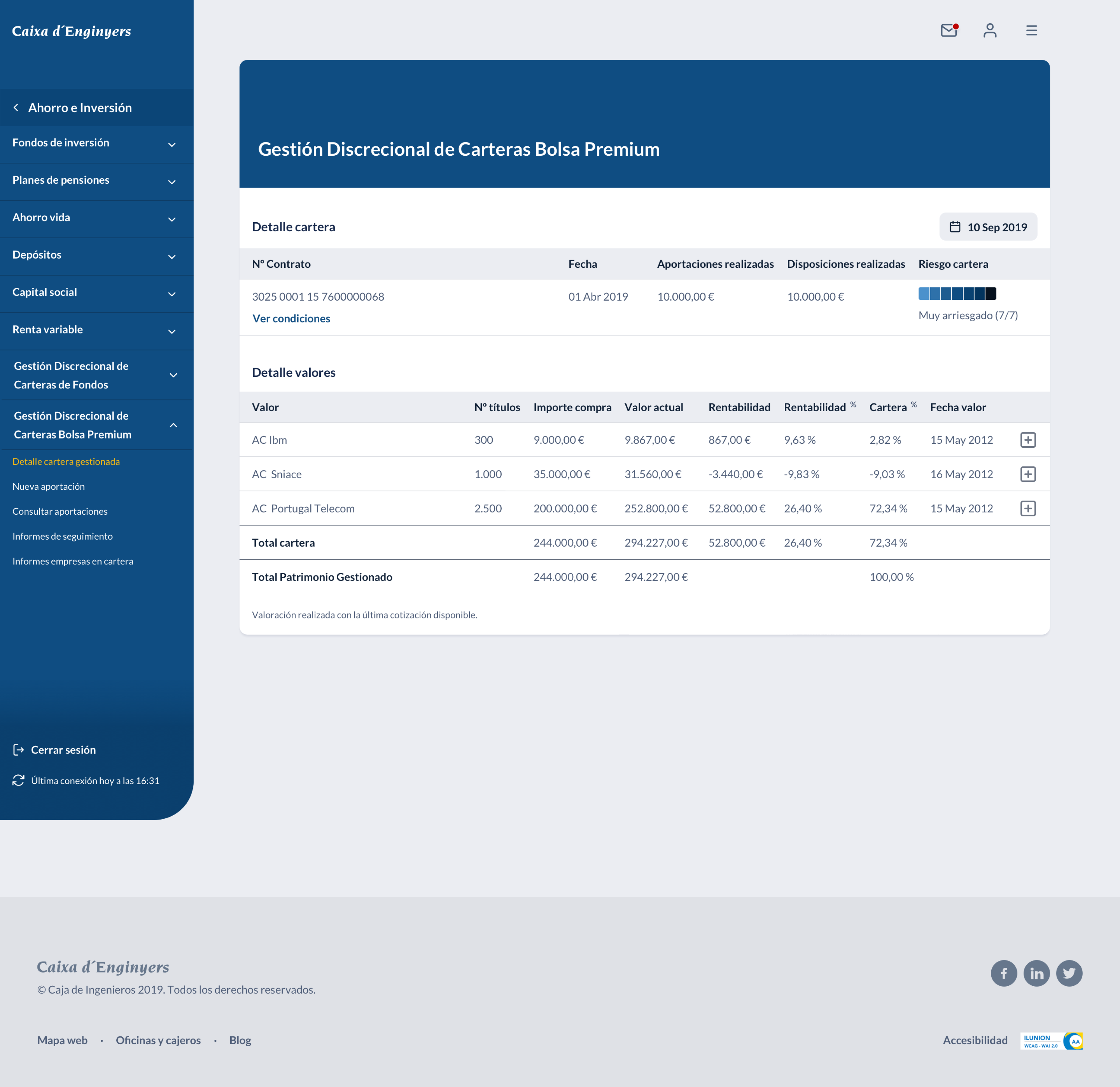
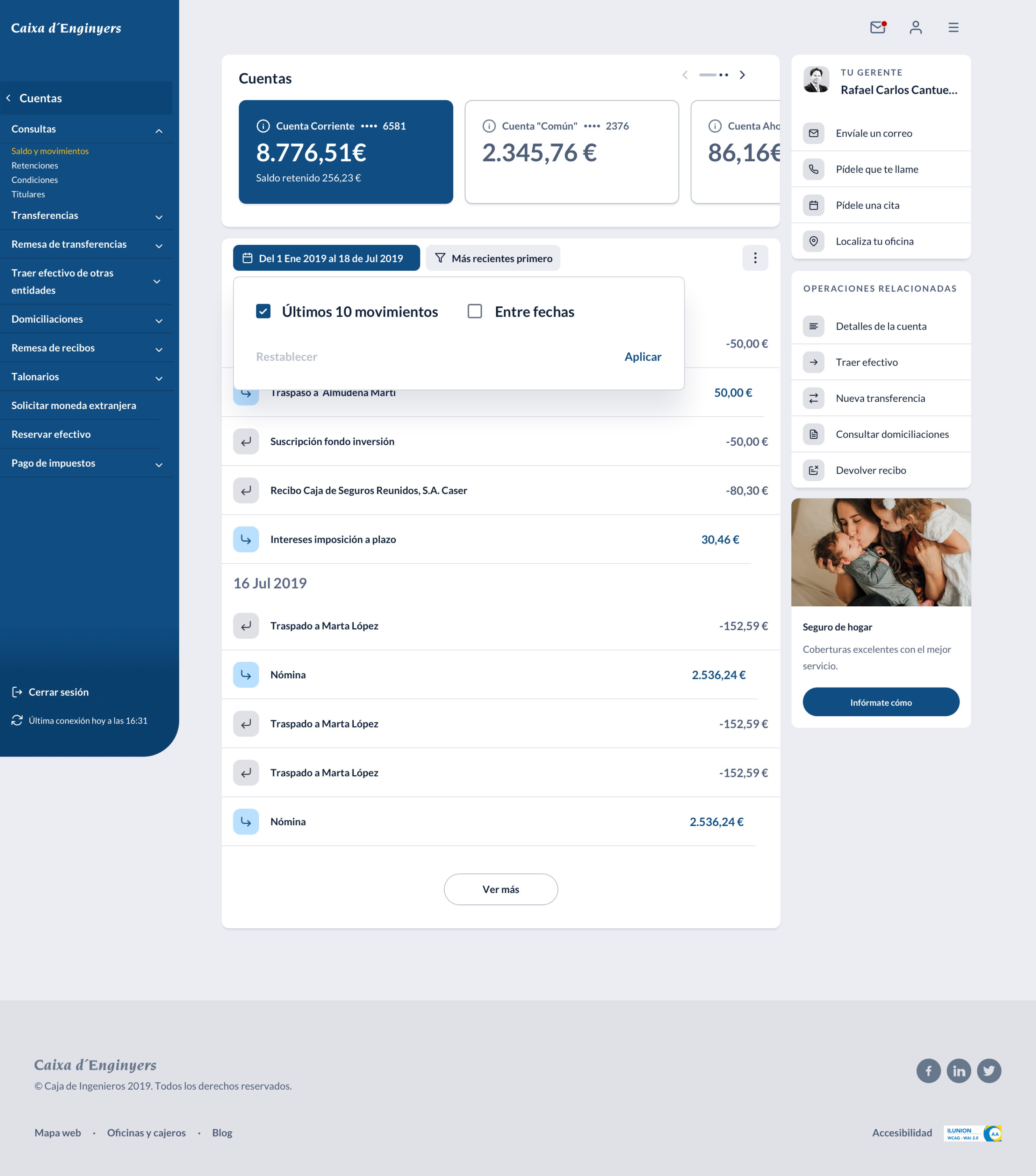
The analysis revealed that users were consistently frustrated by deep navigation paths, with critical functions buried beyond 2 clicks. This insight drove the creation of a modular navigation pattern ensuring transaction actions remained consistently accessible.
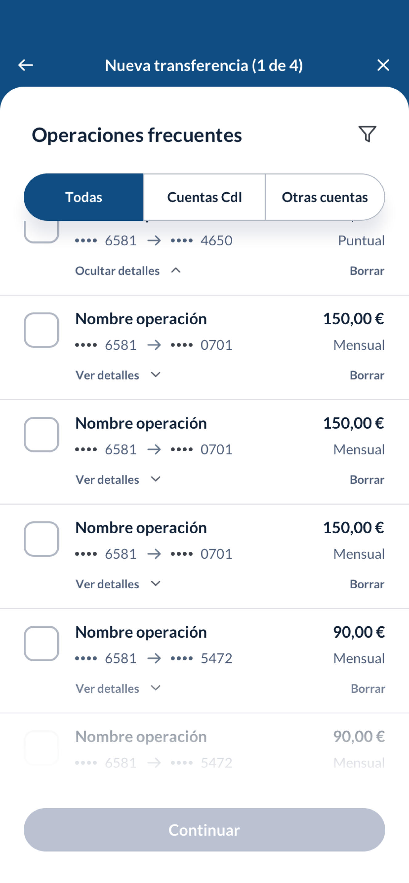
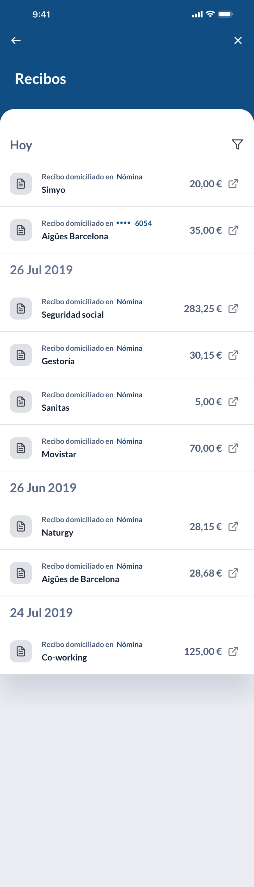
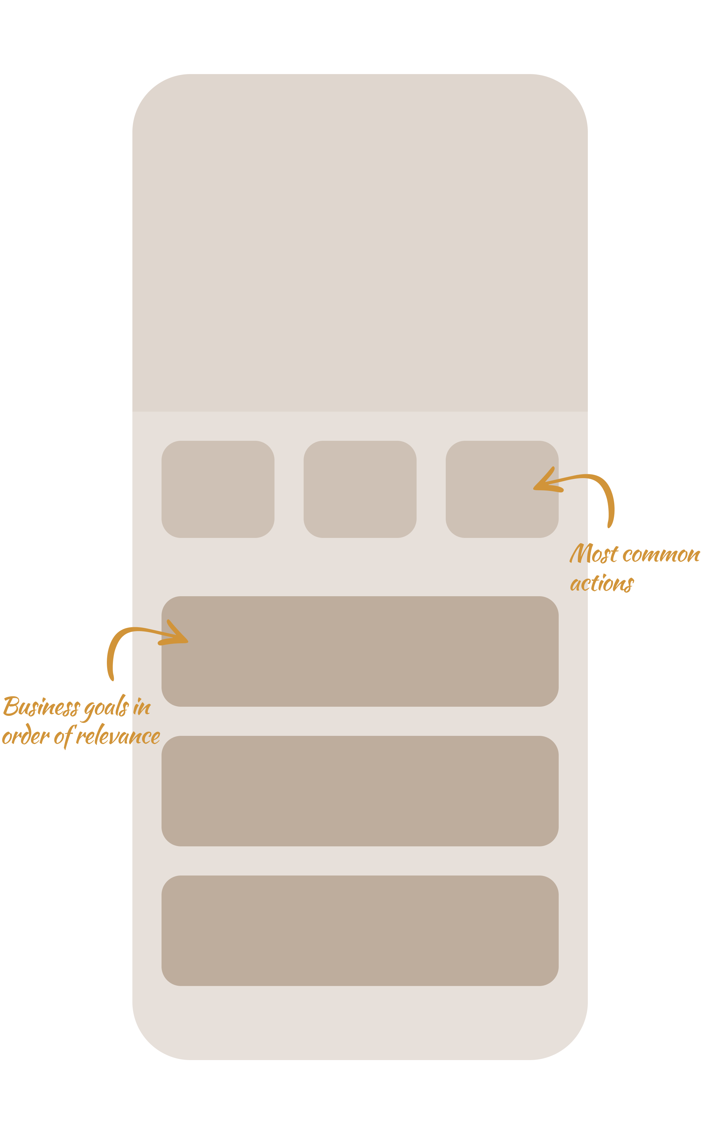
User behavior data revealed significant discrepancies between actual usage patterns and current content hierarchy. The most frequently performed operations were not easily accessible, leading to a complete restructuring of the transaction flow and product arrangement.
Challenge 2
Creating intuitive user mental models
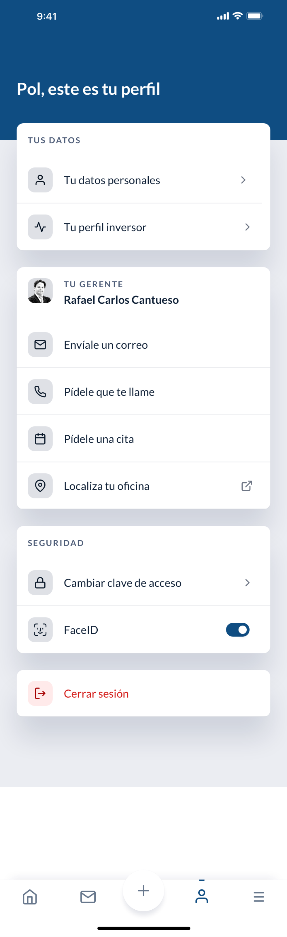
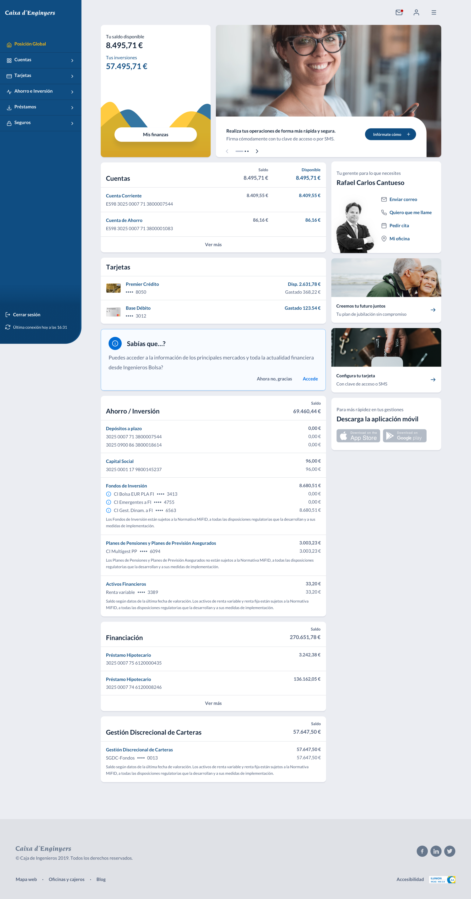
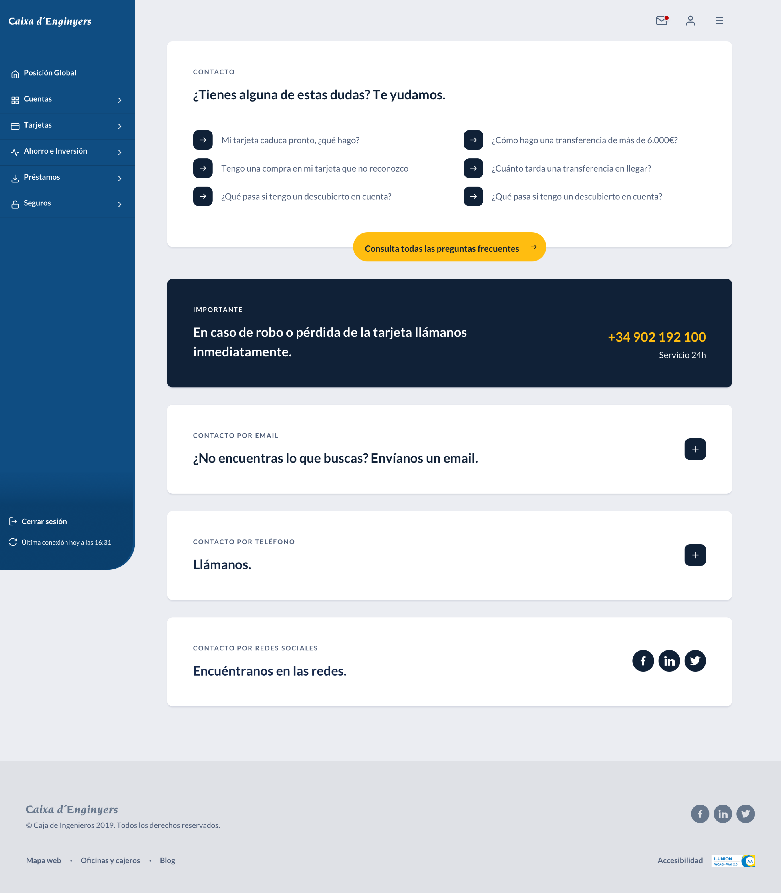
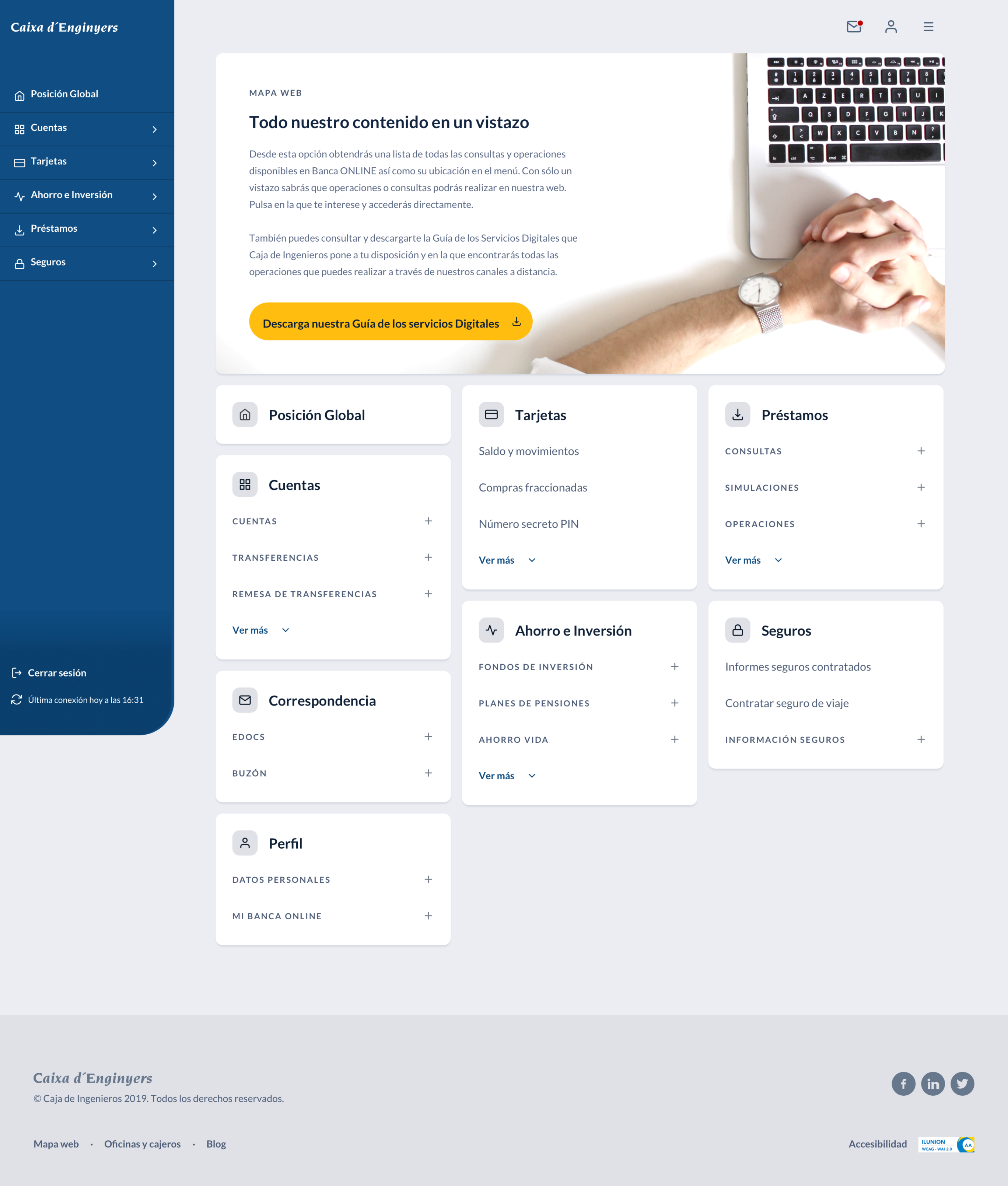
The establishment of five core modules (products, transactions, user profile, communication, and bank resources) provided users with clear, logical organization while our continuous feedback approach ensured every design decision was validated against real user needs before implementation.
Challenge 3
Turning limitations into user control
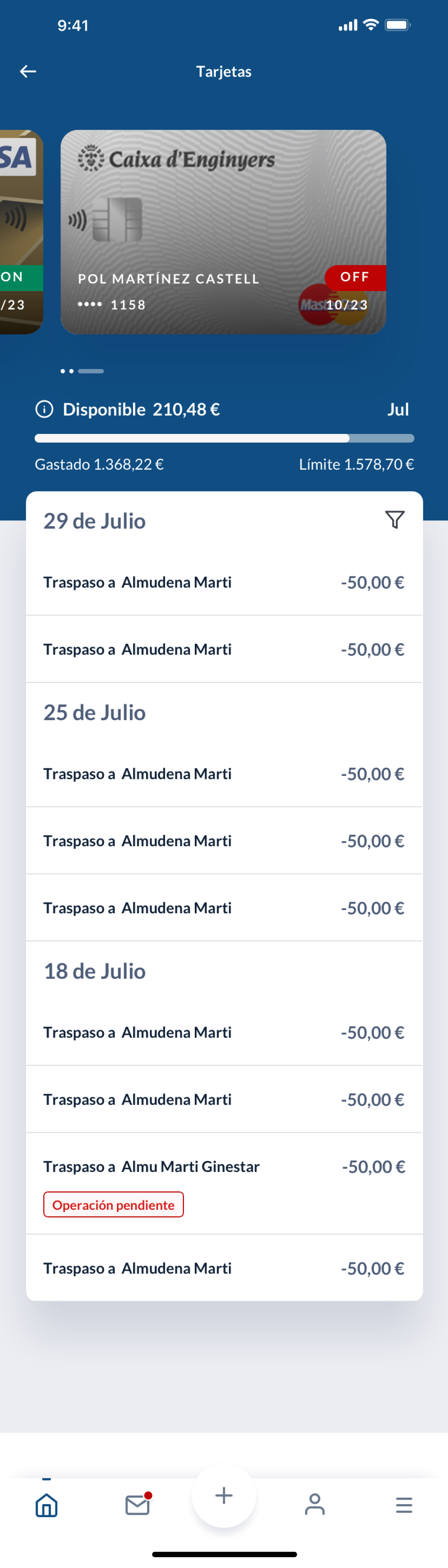
The limitation preventing automatic content refresh was transformed into a user empowerment feature. By making refresh timestamps visible and enabling manual refresh through intuitive swipe gestures, users gained transparency and control over their data currency.
Challenge 4
Design consistency builds user confidence
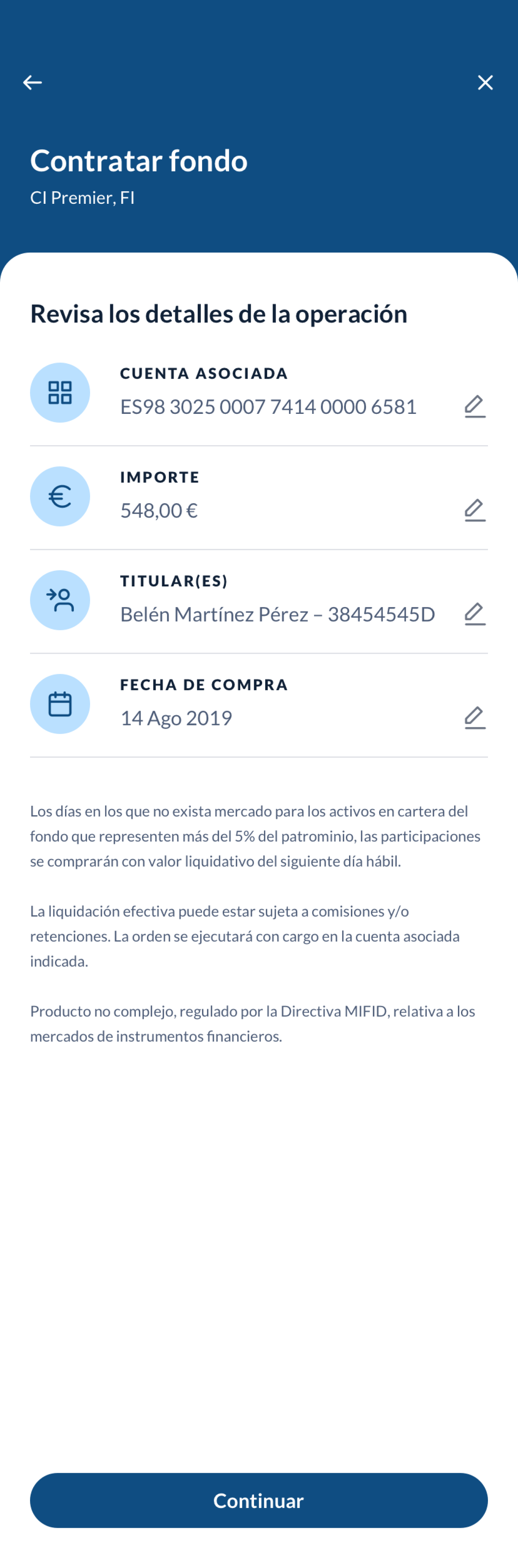
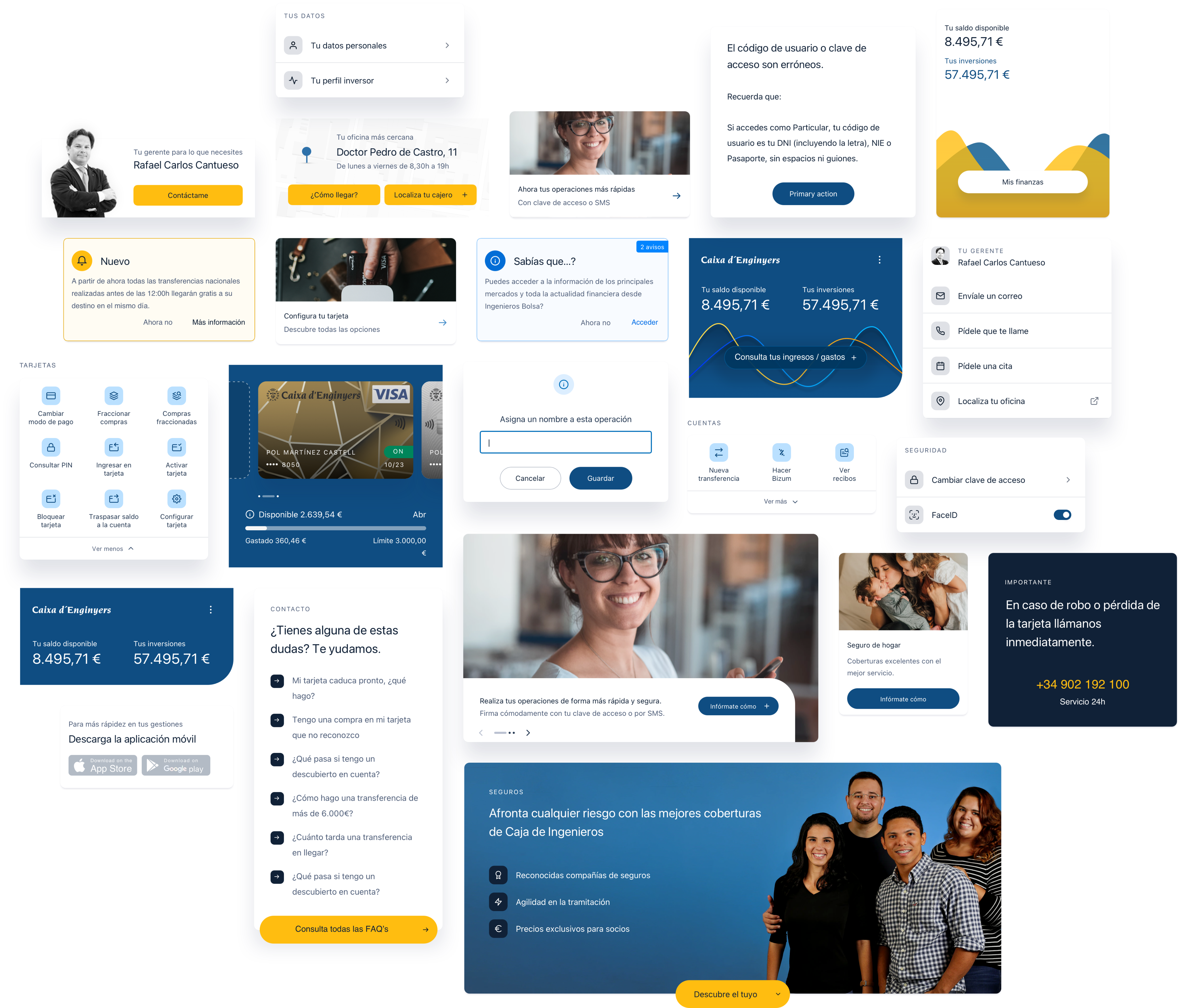
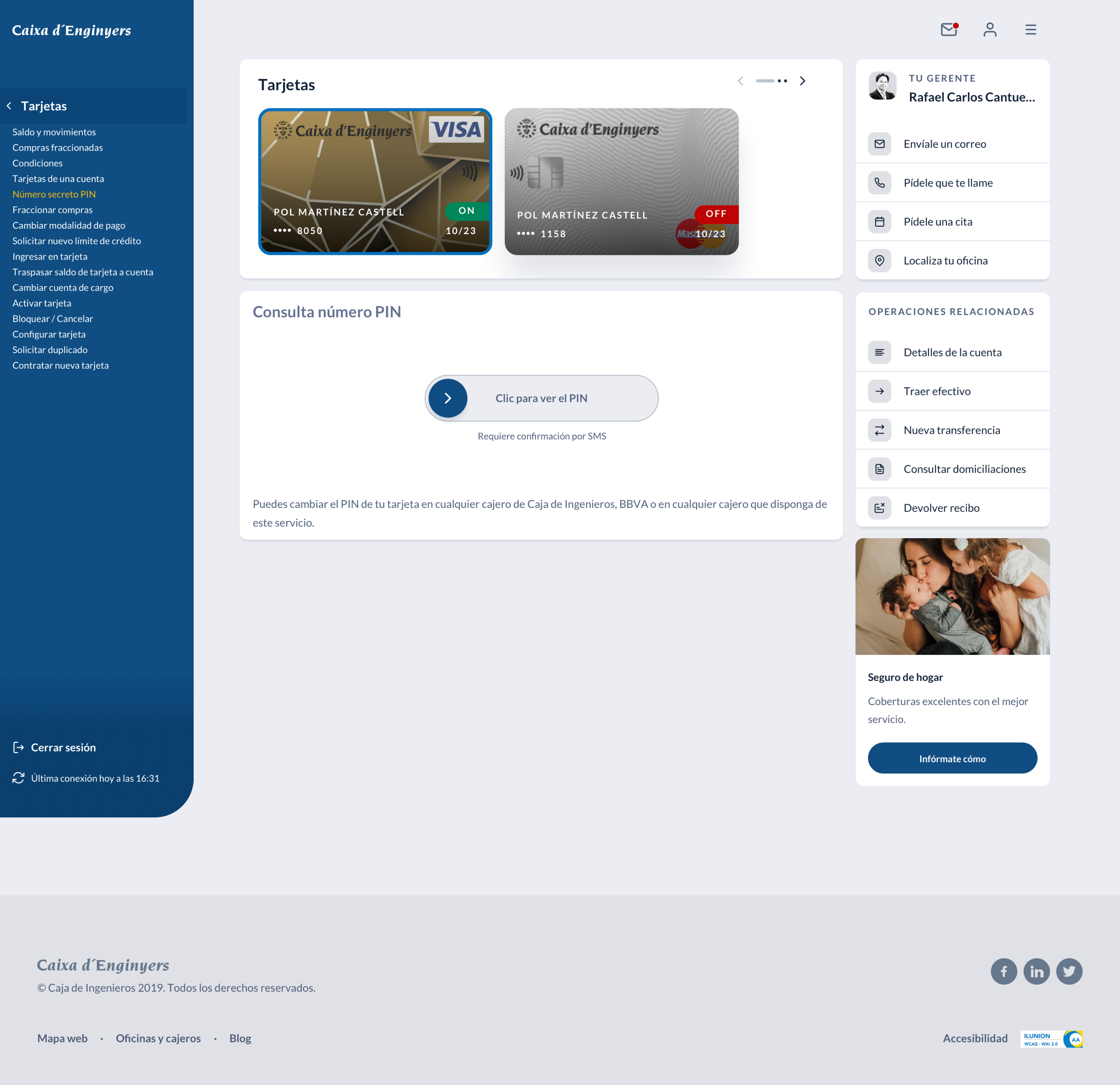
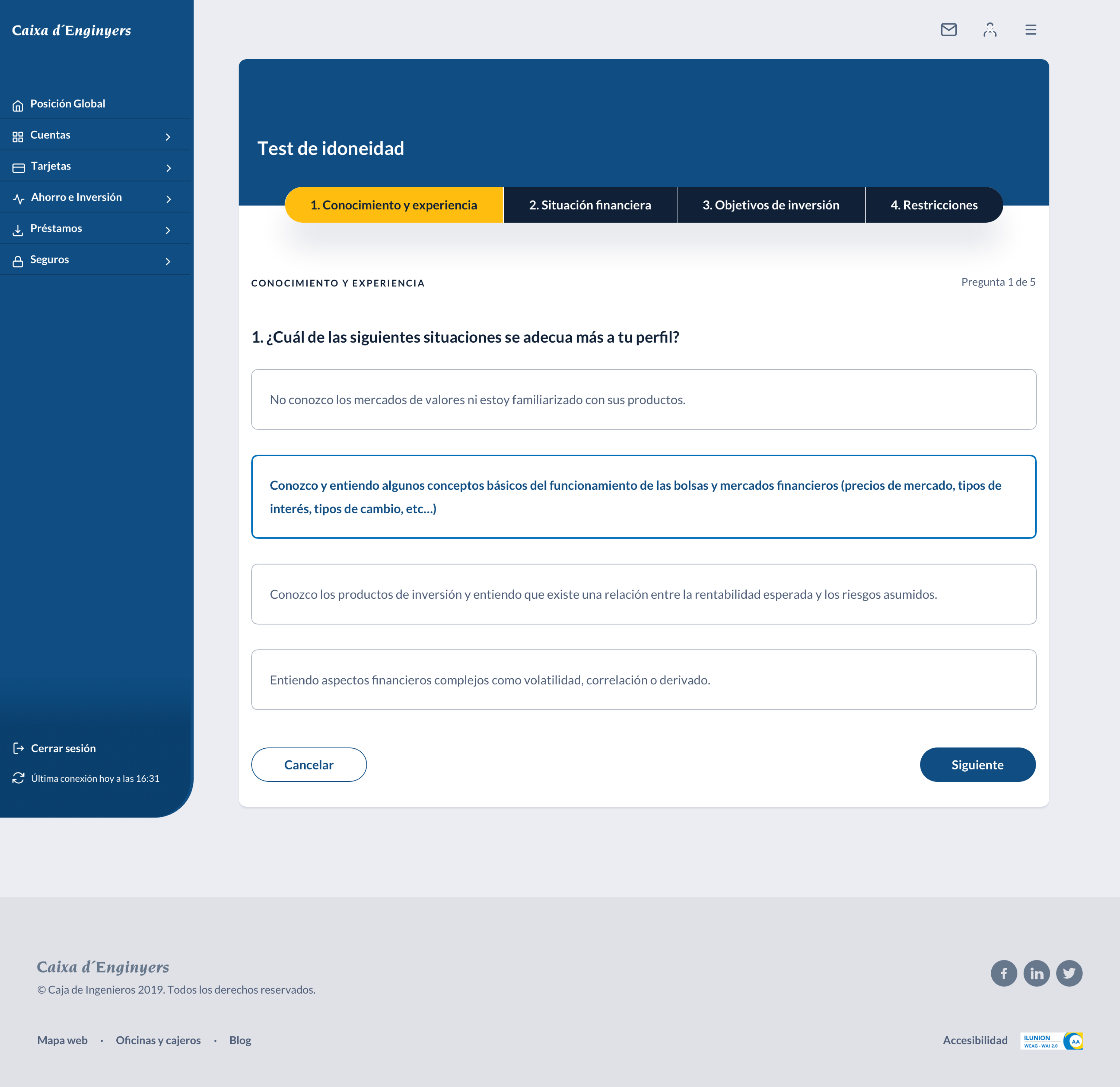
Establishing a comprehensive design system with reusable components created predictable interaction patterns that reduced cognitive load for users. When buttons, forms, and navigation elements behaved consistently across all sections, users could focus on their banking tasks rather than relearning interface behaviors, significantly improving task completion rates and overall user satisfaction.
Turning challenges into user-centered solutions
... and mobile experiences